PurPur
:
Corporate Design For the Campus in Krems
Back
Information
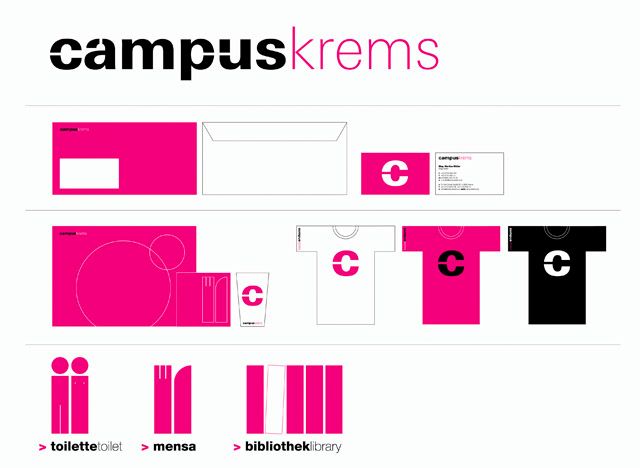
The group PURPUR developed the corporate design for the Campus of the Donau-Universität Krems. A solid and a fragile script were combined for the logo. The breaking open of individual letters lends the word mark individuality and is intended to symbolise openness and change.
Tension via Contrasts
The exciting contrast between the remains of the old industrial substance and the new transparent glass architecture is adopted in the concept for the logo and in the selection of the font. A tension results between the solid heavy script and the fragile thin script. Like the different buildings they form a harmonic unity just as capable of accepting the opposite form while retaining their own individual characteristics. The seamless link between the two words means that they are not perceived or read as individual objects but as a whole together.
Candour and Departure
The opening or prising of the letters polarises the logo, symbolising candour and a new departure as well as an ongoing process of change. It addresses the breaking open of traditional forms – the connection between inside and outside spaces as well as the relationship of the separate individual letters to one another.
C for Centre
An element of the logo is established as a symbol that alludes to the notion of 'centre'. The pared 'C' stands for candour in the Krems Campus as a centre of learning, academic discipline, research, communication, art and culture. It bears a distant association to the pictogram used to denote a town centre: a roughly defined circle which is the result of the cooperation between two independent elements.
(PURPUR)

