Julie Hayward
:
Willkommen in Kreuttal
Back
Information
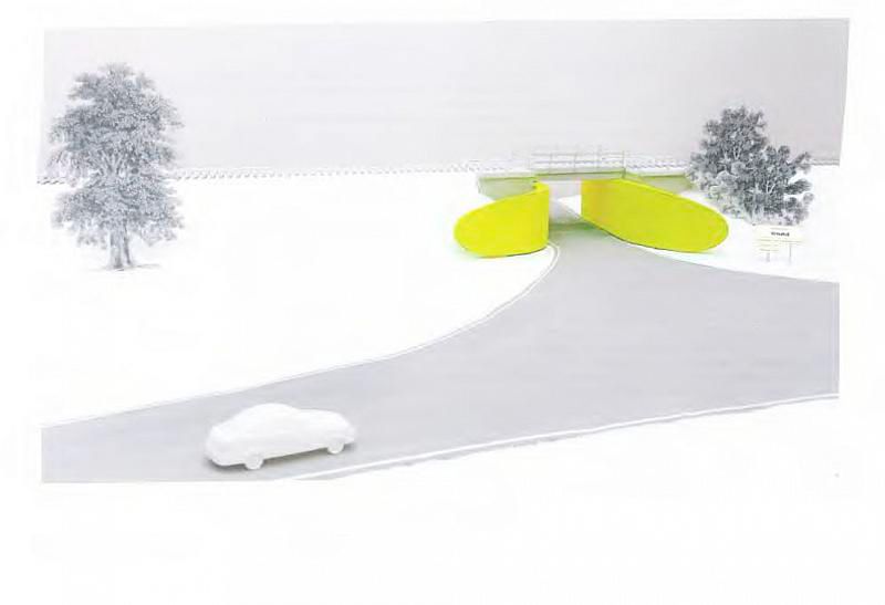
The artist Julie Hayward won the competition for the redesign of the railway underpass in Kreuttal and the area in front of it. The jury was impressed by the clarity of the design, which both simplified the route markings and also integrated a path that, with a sculptural and so a striking character, was supposed to have been built under the bridge. However the proposal could not be realised.
The artist Julie Hayward won the competition for the redesign of the railway underpass in Kreuttal and the area in front of it. The jury was impressed by the clarity of the design, which both simplified the route markings and also integrated a path that, with a sculptural and so a striking character, was supposed to have been built under the bridge. However the proposal could not be realised. The railway underpass in Kreuttal in the Weinviertel stems unmistakably from the 1950s. Hardly anybody would guess that behind it lies a particularly attractive stretch of picturesque countryside. The more that is undertaken to clarify the situation the more confusing it becomes. For over the course of the years the numerous advertisements and signposts have spread to create a proverbial forest of signs that does not exactly make it easier for passing motorists to find their way and which refuses to be of any assistance in making a decision. So in 2012 it was decided to hold a competition for the redesign of the underpass and the area nearby, which was won by Julie Hayward. The jury was impressed by the clarity of her design, which simplified the signposting of directions as well as inserting a route with a sculptural and so a striking character beneath the bridge. It is precisely this double function that defines the quality of artistic designs for traffic use. The proposal could not be realised, however.
Willkommen in Kreuttal (Welcome to the Kreuttal) is the title the artist has given to her design. The route was to be instantly clearly defined visually. Two curved concrete walls were to dock onto the walls of the underpass, lengthening them and giving the tunnel a visual extension. These "winged walls, which are reminiscent of arms or tongues, exert a draw, they absorb one and make one feel welcome" (Julie Hayward). In the design the two walls on the entrance side of the tunnel heading towards the Kreuttal are curved differently to draw in motorists coming from the freeway. On the exit side the walls project by 80 centimetres and are covered with a reflective layer. The result is an autonomous sculpture that links itself to the tunnel. The entire wall area was to have been painted with fluorescent paint — i.e. to have been neon coloured, as the layperson would say. Part two of the proposal is the reduction of the number of signposts. The advertisements for restaurants and the like were to have been moved behind the tunnel. Instead, next to the entrance into the tunnel, under the sign saying 'Wilkommen in Kreuttal' the artist would have shown the names of the four villages that comprise the Kreuttal municipality — clear and simple. A tree would have had to have made way for this clarity, and the entrance to the tunnel was to have been lined with reflective cat's eyes. The design was rejected by the local community.
(Cornelia Offergeld)

