Fremd
BackArtists
- With
Information
Together with the province of Lower Austria and the Austrian newspaper 'Der Standard', the MEZ club launched a public art project based on the medium of the billboard. The background that inspired the theme of the project was the sociopolitical motto selected by the European Union for 1997: "Year Against Racism and Xenophobia". Six foreigns artists or artists'groups living in Austria each designed a billboard. The project has featured some 800 billboards scattered throughout the whole province of Lower Austria.
Since the organizers believed that the notion of racism in the more limited sense of word, i.e., racial ideology, hardly can be seen as a crucial social phenomenon and issue in Austria today, they expanded the theme of the project and asked the invited artists to create something alluding to FREMD (foreign/alien). This seemed to make sense also in view of the fact that ethnically motivated discrimination can be seen as only as an extreme pole of social and individual-psychological complex involving behavioral modes and attitudes that are certainly part of social reality in Austria. This has to do with a mix of motives ranging from harmless resentments felt towards German tourists to sporadic cases of real rasism, from jokes about foreign colleagues at work to the socalled "flood of foreigners" – a main attraction of political election campaigns, culminating in the government's present restrictive asylum policy and the policy of integrating foreigners that it endorses – a policy that has "ranked" Austria "last of all West European nations when it comes to integration policy." ('Der Spiegel', 3.10.1997).
Contributors
- Kuration
Contributions
Otto Mittmannsgruber, Martin Strauß
"We'll stick with our own!"

Otto Mittmannsgruber and Martin Strauß had created an explicitly political billboard. Like Wachsmuth's sketch, the subject-matter also addressed the issue of asylum. Here, however, a sarcasic commentary was staged on the Austrian government's present asylum policy and on the cozy, self-centered mentality that makes such a policy possible to begin with. The intractable - always unspoken - slogan of provincialism: "We will stick with our own!" stood out in large type and seemingly affirmative across the whole billboard surface. But how can this be? An attitude that even in the media world of a small nation would never make a public appeal and is always expressed among its own was allowed here to present itself bombastically and on a large scale? The text was backed by the only motive on the billboard which filled the whole format: an ordinary dishcloth. The household utensil, soiled and obviously used, contrasts even more with the dramatic outcry. A small, tilted rectangle in Austrian red-white-red forms a third element. Its size and placement first recalled the company logos that one normally finds on billboards. Here, however, was a short sentence that informed one of the present state of Austrian asylum policy: the number of asylum appplications that were rejected in 1996. The sad fact is not neutrally presented as information but rather ironically reformulated in praise of an achievment: "This year we were able to ..." - The positive annual reports of businesses begin with such words, or similar ones. In this way a playful dialogue was created between the subjects, the "we" of both sentences - which in turn triggers a dialogue with the viewer. Who are the ones who wish to stick with their own folks, who are the ones who reject 92% of all applications for asylum? Are the two "we" the same? And who would like to belong to which "we"?
Andrea Van der Straeten
without title
For Andrea van der Straeten the exceptional size of the 24-part (illegible) billboard was the ideal size for presenting her photographs of children making faces and enlarging them to monstrous proportions. Pictures of children, along with those of animals, are among the most popular "means of argumentation" used by advertisement experts. Functioning as chlichés they represent innocence, cuteness and, when manipulated in connection with stimulusresponse, they are a subtle form of seduction. On this billboard, though, they assume a completely contrary role: the grimacing children appear in the guise of foreigners, they mimic the faces of persons who frighten us or provoke such. By doing so, they demonstrate the undistorted distortion. They do not reveal their true self nor do they feign it; instead they unabashedly reflect the Other. They are the compelling protagonists of a game that manifest the distance of the implicated rift by means of imitation. In this context of advertisment, this billboard critically revealed the most dogged strategies of suggestion used by the medium. With regard to theme of this project, and against the backdrop of the arguments acually cited in a uncannily pointed way in relation to the "foreigner issue", was strikingly recalled how much of this playful childish curiosity vis-à-vis what is foreign we have lost.
John Silvis
"... do not know ..."
The reduced pictoral idiom used in this billboard seemed related to the efficient and fast communication of pictograms. John Silvis had deliberately connected the two levels of text and picture and in this sense his billboard pursues two different, yet ralated types of perception. Once they were connected they trigger a complex play of meaning. The viewing of the motive as a whole and the perception of each self-contained emblem were confronted. On the one hands, the pictorial objects were carefully seperated from each other and presented against differently coloured backgrounds. On the other hand, individual words that were assigned to each of the objects read like an inchoate sentence: "... do not know ...". The focus on his sentence alone would most simple in keeping with advertisement (slogan plus image), the strict seperation of pictorial motifs, but also of the individual words, suggested that it was a search for a different relation of word and object. If one looked at each field separately, one first noticed the central section dominated by yellow and black: a stretched hand filled the picture surface. Behind it, the word ICH (I) had been printed in capital letters. The I and the hand could have been combined by touching to doing and making to action, to the acting I. The left picture-text-field showed a table fork wich was linked with the word KENNE (know). The fork, the utensil and the knowledge also fit together as ways of incorporating and putting something in place. And both fit with I and the hand. A contrasting approach had been chosen for the right section of the billboard, as the object shown appears unclear: did we see a standing foldable ladder, were chopsticks depicted? Whatever one images, in the perception of this image only the word NICHT (nothing), the negation dominated. Here the question as to the object of negation remained. What was negated - this thing, whatever it was, or a tacit meaning of the three pictorial motifs? Or did the concise sentence only reiterate our inability to identify the object in question? The viewer was expected to grasp the billboard again as a whole, to see the seperate elements together and to read them as such. Silvis had constructed a puzzle-link structure that implicated us in various interpretations but ultimately remained unresolved. In this sense this large-scale billboard playfully integarted the theme of the project in the composition, incorporating it in a language that intrinsic to both advertisment and art.
Simon Wachsmuth
without title

Simon Wachsmuth created a purely textual billboard. He took a passage from the Thora, precesely that one which deals with the right to asylum, and printed in old Hebraic square writing. The text fragment was fragmented a second time in the formal sense - overdimensional in the format with the lines cut and some characters missing altogether. But it was so that someone familiar with the writing could still read the passage and supplement whatever was missing. A translation into German had been placed in the right bottom corner in small type so that it could be only read from closeup. Translation of the Hebraic text (standard translation, 1980), Old Testament, Deuteronomium, 23/16&17: "Thou shallt not extradite a foreign vassal who seeks protection from his master with you. He should be allowed to live with you, in your midst, at a place that he selects for himself in one of the areas of the city, in your area, wherever he likes. Thou shallt not exploit him." The billboard was scattered throughout the region of Krems. Before the Nazi period the largest Jewish community in Lower Austria lived in Krems.
Claudia Lutze
"Mental Map Europe"
Claudia Lutze's three billboard motives related to a project that the artist already began some time ago and has yet to complete: the artist addressed people in various European cities and asked them to react in any way like to the three words "mental map Europe". The result were conversations she taped. A great diversity of material was assembled, answers were given in writing and "geographical" sketches made. Three small drawings that were attained in this way can be found in this billboard campaign, blown up now in large format and mounted in the Lower Austrian borderland region. At first glance one saw that the fragile sketsches in which Europe was depicted were based on other aspects than a recollection of a school atlas or the most recent political maps seen in news studios would lead us to believe. Europe presented itself here - in various manifestations - as a patchwork of graphic shorthand. The familiar boundary lines began to blur, demarcation lines assumed a new course. The drawings were created by persons from very different parts of Europe. On the lower edge of the picture there was a discrete reference to whom, when and where. As documents the sketches spoke for themselves. As billboards in public space they assumed additional impact.
Christy Astuy
"Ohne Titel"
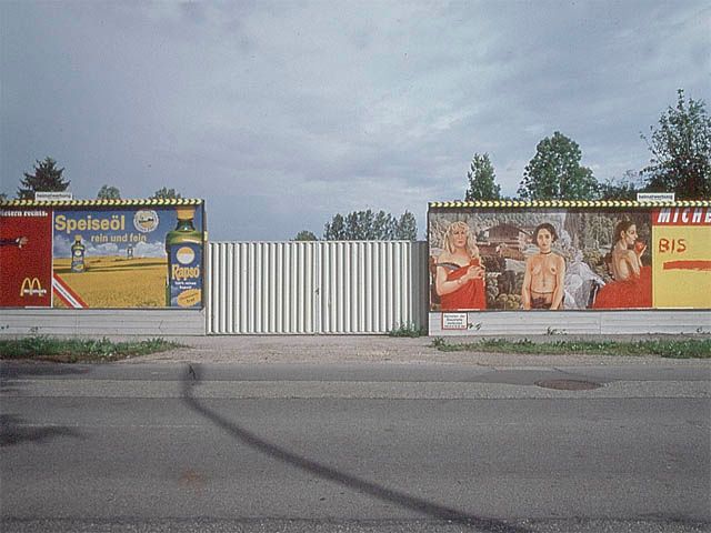
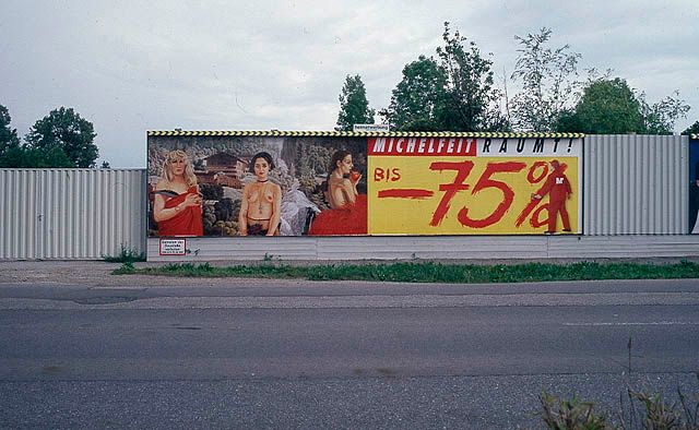
Three women, more or less dressed, stood in front of a mountain landscape with waterfall and alpine architecture. Christy Astuy's billboard first took one by surprise, first because of the opulent means, the rich colors of her painterly rendition. With the billboard as medium, she was able to archieve an effect that is truly unusual, also because she did not add any text, limiting her design to purely pictorial means. At the same time, her motive was based on clichés - mountain landscape, waterfall, and for the viewer with erudition, also the reference to the familiar motive from Greek mythology - and thus moved closer to its context, namely that of advertisement which only speaks in sterotypes. Also the collage style used by the artist - the landscape background was taken from a 19th century etching, the figures from the artist's recent paintings - mad her billboardappear "flashy", while at the same creating a subtle painterly contrast. The three female figures were painted portraits. Both in a formal sense, in the way they were painted, and in the mimic expression of the portrayed figures they showed a measure of individuality and intimacy normally not found in this medium. The figures were large and had been prominently placed in the format. But they also were autonomous, self-contained. The picture thus conveyed a certain pathos, that of the individual woman. Seen in connections with the rest of the project this billboard advocated a strict prionciple of individuality. It appealed to the individual and its value independent of background and affiliation to any groups.


