:
Graphic Design For the Municipality Erlauf
Back
Information
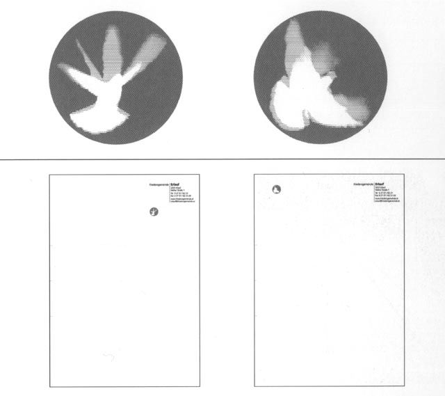
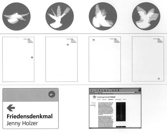
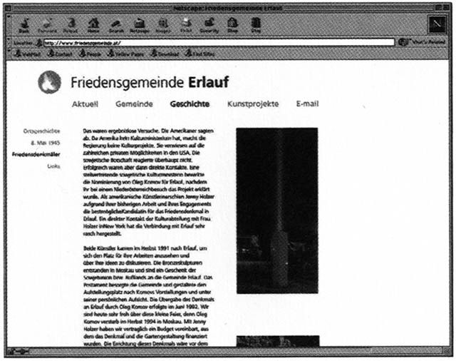
Dieter Auracher developed a design concept for the community of Dieter Auracher developed a graphic concept for Erlauf, which bears the epithet 'Friedensgemeinde' (peace community), consisting of street signs, a homepage and writing paper. The graphic designer chose a familiar symbol for the logo, a dove, but one that appears flying in different positions.
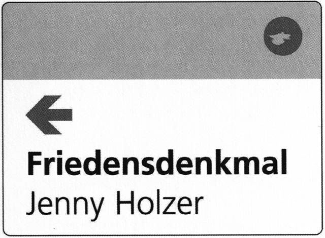
Now that the market town of Erlauf has been given a design structure it also has a new style of its own which underlines its historical relevance as a 'peace community', playing on the familiarity factor, but using a fair share of moderation too. Thus, Dieter Auracher did not create a new logo, but deliberately picked out the all-familiar dove which he then developed into a modular logo. He kept its basic shape and theme, changing details as he went along. By maintaining a formal distance to the classical depictions of the peace dove he created a new identity and established a coherent link to our times. Along with the logo the graphic artist created information plates made of printed acrylic glass, as well as a homepage and all relevant printed matter. He very skilfully managed to use the same kind of typography throughout, taking into account the factual and functional aesthetics of modernity and establishing the link between aesthetic effect and maximum clarity. The basic Frutiger typeface with its open and reduced lines is easily legible from a distance and thus particularly suitable for signposting.
(Cornelia Offergeld)


