Blind Spot
BackArtists
- With
Information
In June 2003 an extensive poster campaign entitled 'Blind Spot', involving a total of 800 posters, was launched in Lower Austria. In contrast to most art projects involving posters, in which they are one-offs or only put up in very small numbers, it would be accurate here to talk of art actually latching onto this mass medium. Communication specialists have calculated that the average reception period for an advertising poster today amounts to not even two seconds. In contrast to a perceptual field conceived in this way, the question for the artists is one of whether to correspond and subject themselves to this apparent or actual compulsion for what is catchy. Or, on the contrary, does precisely this honing of the medium offer special scope for art and – in comparison with the museum – a field of quite new referential possibilities? The big advantage of art posters is that they are almost always without a sender. They don’t have to sell a product. Yet above all else it is the communicative strategies of the art poster itself which, even if it adopts the forms usual in graphic design, create a distance between it and the simple orientation towards its environment. Frequently used are also 'minimalist' strategies of information denial, which open up a wide range of interpretative possibilities. The artists attempt to counteract the simple readability of the advertising language by creating aesthetic products which offer multi-layered possibilities of meaning.
Contributors
- Kuration
Contributions
Erwin Wurm
The piece by Erwin Wurm that was used came from his series 'Instructions on how to be politically incorrect'. An exception was made here in that the image placed in the poster medium formulated its prescription clearly and distinctly, i.e. it was placed in a medium whose purely appellative character always remains latent and discreet in the background and never reveals itself openly – since the implicit command 'Buy!' is of course never explicitly noted. However in relation to the other and sole aim of the "favourite medium of manipulation",1 which exclusively serves consumerism, the content of this 'instruction' tended to be rather poisonous: "Steal from beggars." The ironic quality was also intensified in Wurm’s subject, as it was in Breuning’s Double, through its inclusion in a commercial context.
Not only that: in this case it also meant that the image tended to acquire a broader significance which it would have failed to achieve in the event of a simple art-specific reception within the framework of an exhibition. Consumerism – buying – stealing: in this way – namely, solely through the contextual relation, and without beating about the bush, connections are made which inconsiderately shed light on the cynical aspects of society. The amicably scornful provocation of offering the art viewer instructions for 'politically incorrec'’ behaviour was unexpectedly transformed into a cynical imperative by being transposed to the public space and made to confront the general public; its proximity to neighbouring posters, which always scream nothing else but "Buy me!" evidently endows the subject with an additional explosiveness: "Steal right now!" And the fact that the design of the image, in which an attractive young woman fashionably dressed in a black costume, helps herself to something from the beggar’s hat superficially appears to also satisfy the
Roy Villevoye, Jan Dietvorst
For their poster the Dutch artists Roy Villevoye and Jan Dietvorst combined two stills from their film us/them (2001), which was shot in Papua New Guinea. The video stills derive from an interview scene in which a local friend of the artists, Pupis, talks about a trip that his two cousins had undertaken to distant Amsterdam the year before. Both with regard to the subject and from an aesthetic point of view, the work firmly refuses to comply with what one expects from large-scale posters: the rough, rather unfocused aesthetics of the video still; depicted is a black person – but not a handsome black model at all – whose gaze is directed straight toward the viewer etc. On the other hand, the fundamental parameters of the communicative structure effected here were very powerful: the black man ‘speaking’ to a white viewing public; also, the use of gestural language to appeal to the traditional poster rhetoric of the demanding man was hardly a matter of accidental design. This, in turn, means that the work is in a particular tradition of political posters of the past, going back to the war posters of the First World War – the famous poster showing Lord Kitchener or Uncle Sam, each of whom also has a raised forefinger directed towards the viewer: "I want you for the army." Pictorial rhetoric which, as is well known, no longer plays any role in present-day political advertising.
However, quite unlike the historical propaganda, the use or re-use of that figure's appellative gesture contrasts with the subject's relative openness as far as significance is concerned and in the connection between image and text. The quotes from the interview are chosen in such a way that there are many connotations on the textual level in the three short sentences. For example, in the left-hand picture it says: "Why am I not allowed to see it there?" (and not: "Why can't I see it there?", the meaning of which would be the same), and with that alone there automatically resonates the whole story or the discussion of colonialism/racism: the black man who has to ask for permission. The subtitle in the second video still, "The next time I will go with you", then leaves it unclear what exactly is being addressed. (What is the next time? Go where?). Yet precisely for that reason the sentence contains – elevated from its concrete sense in the film interview – a trans-individual meaning that effortlessly also includes, for example, the general relationship of ethnic groups to one another. Taken together, the undertones and connotations which resonate here articulate an almost poetic content of the image, which in turn allows it to protrude from the poster context even more obviously.
Otto Mittmannsgruber, Martin Strauß
As in the case of some of the other poster projects by Otto Mittmannsgruber and Martin Strauß the technical structure of the medium – being organised into individual sheets – was also utilised for the artistic concept behind the design for Blind Spot. Photographs were taken of three building elements from typically anonymous examples of housing block architecture (windows, windows with blinds, sections of blank wall), which could be placed together as image modules on the posters and varied as desired. The usual serial grid of large-scale posters then did the rest: poster areas were transformed into facade areas. What one might call a primitive description of architecture of course has its analogy in the primitivism of the model: it reproduces it, repeating its crude serialism, which, under the dictates of economy, has for decades predominated as the most efficient method of modular construction for cheap block buildings and mass accommodation – the ugly side of the worldwide increase in urbanisation.
The form of each individual poster was left up to chance – or to the arbitrariness of the people hanging them, who were able to place the various sheets in any order at whim, with none of them being quite the same as another. This variability often remained completely open even in extreme cases: for example, a poster board which only consisted of the parts of closed window. However, this openness did contrast to the blindness of the motifs that were depicted – maximum variation led to total redundancy. From another point of view the whole concept had a further effect: the usual advertising poster and all the other commercial signs are attached to architecture, they perforate the volume of buildings bit for bit in the name of the consumer lifestyle. The visual gap which commerce is tearing open in the present-day reality of architecture was pictorially filled here as it were. This means that the posters also provided an ironic throwback to the illusionist wall painting of past epochs – and Potjomkin’s houses did indeed sometimes have residents.
Tomaz Gregoric
The Slovenian photographer Tomaz Gregoric participated in the project with a picture from the series Periphery. Gregoric indicates that in the case of Periphery it is not a matter of staged shots, but rather of documentary ones: a landscape of grass near Ljubljana through which two policemen are walking. Landscape subjects are usually avoided on posters: in the image structure of posters everything is normally shifted to the front, things should be large and present and catch the eye immediately, and the spatial depth of landscape subjects evidently contradicts this principle. In addition, the two policemen here were tiny in the high grass, making them hardly perceptible at all for people passing by in a car. Together with the pair of sad half-dead birches it therefore presents a kind of Beckett-like tableau, in no way obeying one of the rules of the game for the medium, namely the compulsion to be catchy. For this reason, even from a formal point of view, the subject was already a decidedly foreign body in the media context, although it should also be noted that the fact of being a foreign body here does not by any means provide sufficient justification for its transfer from the gallery – and this of course applies to every piece of art in public space. Nonetheless, precisely through its inclusion in a medium – with the simultaneous distance to that medium – which is subject to a quite different mode of reception, a further quality of Gregoric’s work becomes all the more evident: the photograph refers to a much older type of image from the history of art, concretely that of Baroque landscape painting where the sympathetic reciprocal relationship between the figures and the landscape expresses that – now lost – relation to the world, the basic tenor of which is humankind’s state of being embedded in nature.
In several of the situations already mentioned above in which a large-scale poster is encountered in the country, it may be precisely this context – even for those who have no education in art history – is far more effective than as a simple murmur of approval. On the other hand of course, this is in glaring contradiction to how we today almost automatically receive the emotional colouring of an image such as that created by Gregoric of two solitary men, somehow lost in the landscape. It was therefore once again the change of context, from the exhibition to the public space and to a medium in which the image is actually 'displaced' as far as its communicative gesture is concerned, which influenced the mood and perhaps also the significance of the image, intensifying or even changing it in accordance with the surroundings and at any rate enriching it. The question which the image raises and which of course cannot be 'answered' here either, was seen in another more poetic light: what were the policemen doing in the grass?
Olaf Breuning
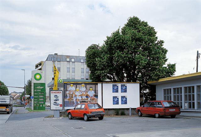
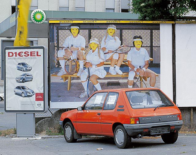
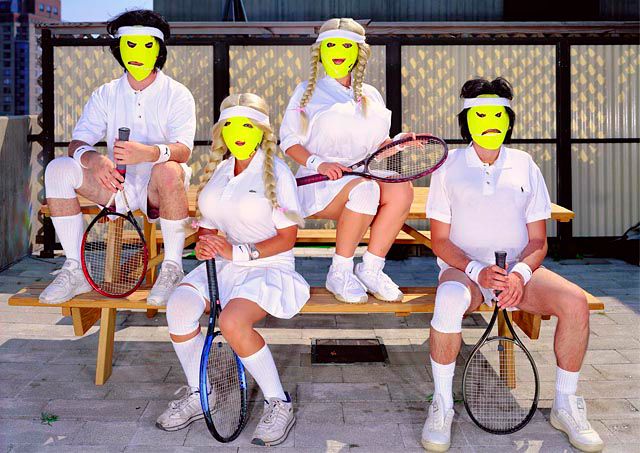
In Breuning's case, the use of the clichés of popular culture constitutes his artistic agenda. As in the case of many other works by the Swiss artist, his Double assembles the signs and codes of the everyday world into a strange collage. Yet at first glance the poster presents an apparently commonplace scene which at most seems strangely frozen: two women and two men all in white tennis kit and with rackets in their hands are sitting at and on a picnic table. If it were not for the oddly yellow masks, one might at first have thought that this image in the midst of all the other advertisements was promoting sports accessories. Only upon closer examination do the details show a more grotesque design: all four are wearing wigs, the men black ones, the women blonde ones with thick braids, the two women have large inflated balloon breasts bulging artificially from their polo shirts and each of the people has a bandage on his or her right leg etc. Breuning combines stereotypes from our collective repertoire of images – from the experiential worlds of TV, cinema, fashion, art and also from advertising – yet at the same time he exaggerates them or subtly undermines them. That is why the excitement of the proximity to the advertising medium which has an even greater effect in this case. Placing it in a media context, which is committed to such clichés more than anything else, sharpens the image's ironic distance to an even greater extent. Here, more than might have been the case if it had been shown in a gallery, its quality as a surreal commentary on the uniformity of the present-day leisure industry became virulent, while the artificiality of the scene – the silly masks, the bizarre play of clone-like sameness and indistinguishability – mercilessly brought out the absurdity of the sporty dress code. To greater effect than would have been the case in an art exhibition, the act of satirically questioning beautiful appearances and the suggestive power of the world of consumerism is placed in the foreground, an aspect which always plays a role in Breuning’s work.


